

Global design agency, Turner Duckworth, with offices in the U.S. and the U.K., has crafted a new visual identity system for Maker’s Mark, an iconic premium bourbon brand from Loretto, Kentucky.
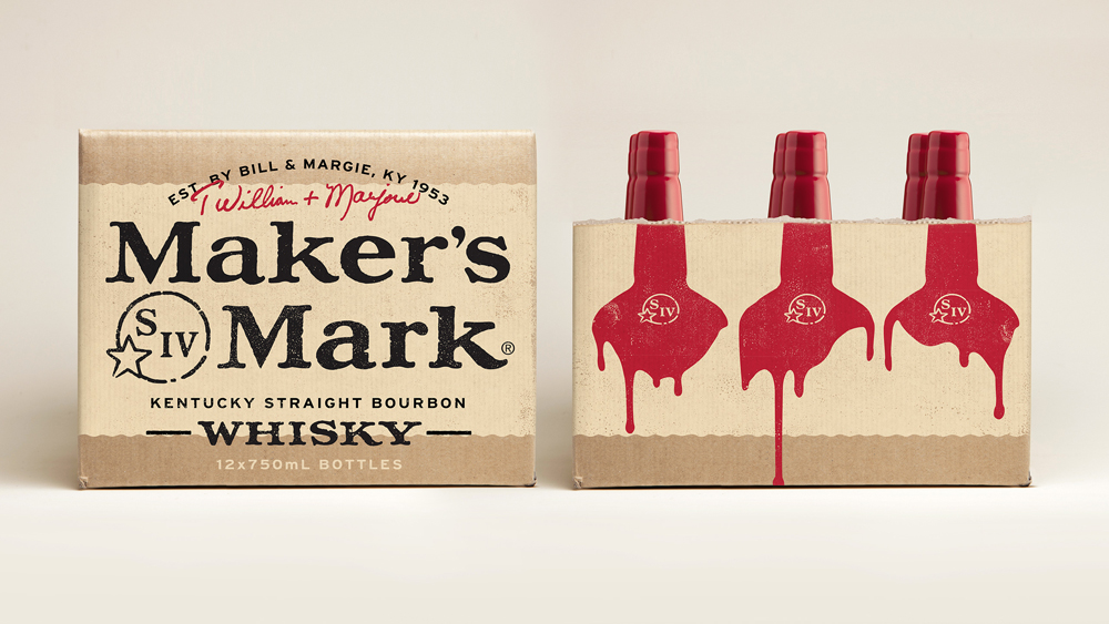
The unmistakable Maker’s Mark bottle has remained virtually unchanged since 1958 – its red wax top is one of the most recognizable elements in the bourbon aisle. Building upon this unmistakable element, Turner Duckworth crafted an authentic, handmade approach
to design that remains true to the original values of Maker’s Mark. The result is a rich visual language that celebrates the history of the brand.
“The bottle acted as a North Star that we held all our creative work up to,” said Jared Britton, Creative Director. “Setting our direction, we wanted to contemporize the identity in a way that felt reflective of the original source, and ultimately create a foundation for Maker’s to become a true global icon.”
Turner Duckworth ensured the new identity would remain distinctive and enduring for any generation of bourbon drinker by crafting every detail.
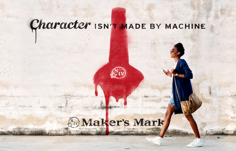
The identity flexibly reinforces the brand’s core equities – leaning into its red and cream color palette, the introduction of a wax icon to graphically represent its most unmistakable asset, and abstract representations of the ‘red dip’ throughout the system. Assets were handcrafted using traditional wood etching techniques, while two custom fonts were created based on the beautifully imperfect language found on the original label. The end result is a system that lives and breathes the brand idea of ‘hand-made,’ just as the Maker’s Mark Distillery has crafted its bourbon since the first bottle was sold.
“When my grandparents had the vision to create Maker’s Mark more than 60 years ago, it was my grandmother Margie Samuels who knew capturing our distinctive character on the outside of the bottle was just as important as the purposefully crafted whisky on the inside,” said Rob Samuels, Chief Distillery Officer at Maker’s Mark Distillery. “She was the visionary behind our iconic label and logo, our bottle design, and of course, our red wax, and I think she would be proud to see how we’re bringing her eye for design forward in every aspect of our brand as we introduce Maker’s Mark to more whisky fans the world over.”


